The Psychology of Color: How Your Home’s Palette Affects Mood
Have you ever walked into a room and instantly felt calmer… or more energized… or weirdly uncomfortable without knowing why? Chances are, color had something to do with it.
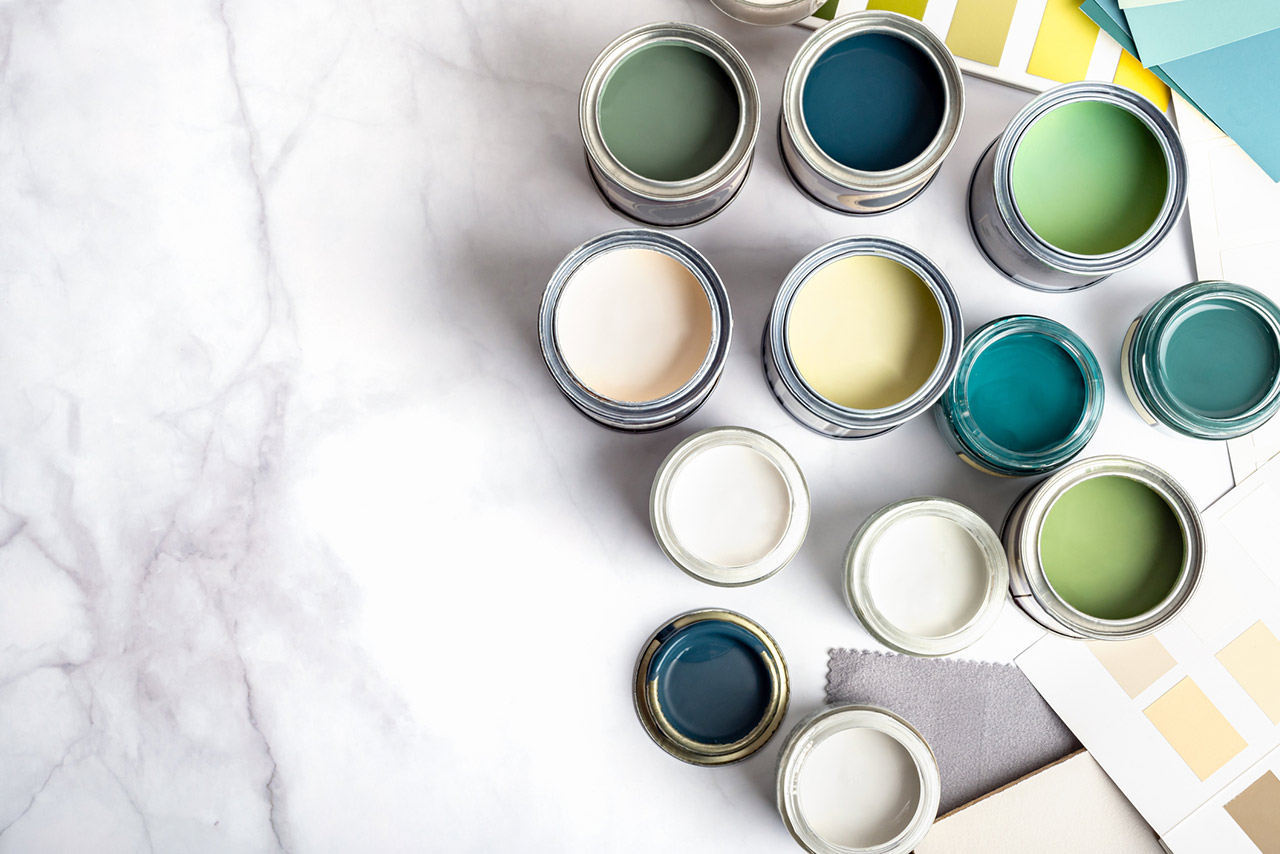
Color isn’t just about style—it’s emotional. The shades you surround yourself with can influence your mood, energy levels, focus, and even how welcome a space feels. Whether you realize it or not, your home’s palette is having daily conversations with your brain.
Let’s break down what different colors actually say—and how to use them intentionally.
Blues: Calm, Trust, and a Deep Exhale
Blue is the ultimate chill color. It’s associated with calm, stability, and clarity—think ocean waves or a wide-open sky.
Best for:
- Bedrooms
- Bathrooms
- Home offices
Why it works:
Blue lowers stress and slows the heart rate, making it perfect for spaces where rest or focus matters.
Design tip:
Soft blues and blue-grays feel serene, while darker navies add sophistication without heaviness.
Greens: Balance, Renewal, and “Everything’s Fine” Energy
Green sits right in the middle of the color spectrum, which is why it feels so balanced and grounding.
Best for:
- Living rooms
- Kitchens
- Anywhere you want a relaxed, welcoming vibe
Why it works:
Green is tied to nature and restoration. It’s easy on the eyes and creates harmony without being boring.
Design tip:
Sage and olive tones are having a moment—and for good reason. They feel modern and timeless.
Yellows: Happiness, Warmth, and Subtle Motivation
Yellow brings light, optimism, and a sense of warmth into a space—like sunshine
without the sunburn.
Best for:
- Kitchens
- Breakfast nooks
- Entryways
Why it works:
Yellow stimulates creativity and positive energy, making it great for spaces where people gather.
Design tip:
Stick to soft or muted yellows. Too bright, and it can quickly tip from cheerful to chaotic.
Reds: Energy, Passion, and Bold Statements
Red is powerful. It raises energy levels and commands attention—which can be amazing or overwhelming, depending on how it’s used.
Best for:
- Dining rooms
- Accent walls
- Spaces meant for socializing
Why it works:
Red stimulates appetite and conversation, which is why you often see it in restaurants.
Design tip:
Use red as an accent rather than a full-room commitment unless you really love drama.
Neutrals: Comfort, Flexibility, and Timeless Appeal
Whites, beiges, grays, and taupes get a bad rap for being “boring,” but they’re emotional workhorses.
Best for:
- Open-concept spaces
- Hallways
- Homes with evolving styles
Why they work:
Neutrals create calm and allow your furniture, art, and personality to shine.
Design tip:
Layer textures (wood, linen, stone) to keep neutral spaces from feeling flat.
Dark Colors: Cozy, Moody, and Surprisingly Comforting
Deep charcoals, forest greens, and rich blues can make a space feel intimate and grounded.
Best for:
- Bedrooms
- Libraries
- Dining rooms
Why they work:
Dark colors create a cocoon-like effect that feels luxurious and intentional.
Design tip:
Balance dark walls with good lighting and lighter accents to avoid a cave effect.
The Big Takeaway
Your home doesn’t just reflect your style—it shapes how you feel every day.
The most successful spaces aren’t about trends or rules; they’re about choosing colors that support how you live. Energizing where you gather. Calming where you rest. And welcoming everywhere in between.
Because when your home feels good, life tends to follow.
Recent Updates
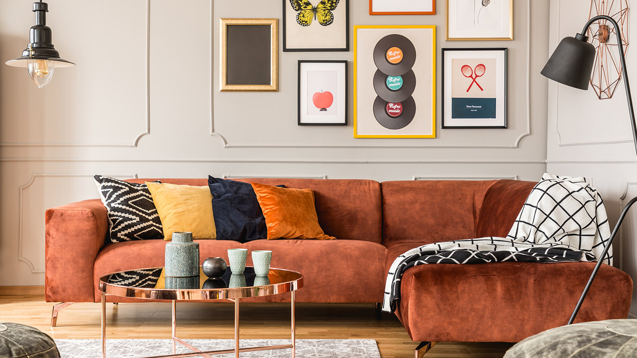
Your Home Has a Personality. Does Your Furniture Know It?
Every home has a personality — from the minimalist who loves a little breathing room to the maximalist who believes more is always more. Discover how furniture, color, and those wonderfully unexpected design choices reveal who we are, and why the most memorable homes are the ones that feel unmistakably personal.

What If Your Home Could Give You Back an Hour a Day?
What if your home could take a few things off your plate every day? By simplifying routines and letting technology quietly handle repetitive tasks, a smarter home can give you something far more valuable than another gadget—more time to enjoy your life.

The House You Want vs. The Life You Want
The dream house and the dream life aren’t always the same thing. Before adding another feature to your must-have list, ask yourself a different question: What do you actually want everyday life at home to feel like?
Contact Us
Karen quinn
(949) 636-9930
kcq@regencyre.com
25950 Acero., #100
Mission Viejo, CA 92691
CA DRE# 00623089
Quick Links
Brokerage Info
25950 Acero., #100
Mission Viejo, CA 92691
DRE 01200533


All information is deemed reliable but not guaranteed and should be independently reviewed and verified.
Powered by Sprout Interactive